
Hello Crafters ,
Limitless possibilities and endless experimentation can be done via them .
As far as , in my two year experience of Distress Inks , knowing them via more than 50 videos on you tube I cant imagine a single project without their use .
I am trying my best to summarize each and every aspect which I have learned from these .
You must have noticed , that almost every tutorial on Crafters corner has a part of distressing in it .
In short , Crafting begins with distressing . There might be a possibility where you think I am wrong with colors , in that case please please please free to correct me via comments below , as we all know - in distressing - knowledge never ends .
What is Distress Inks ?
Distress inks are produced by Ranger Industries { USA } under the guidance of Tim Holtz . Probably when he made it , he even had no idea about the possibilities .
They are basically a pad soaked with ink in a box measuring 2 .5 by 2 . 5 inches approx .
Till now 36 + 12 colors have been released and crafters corner is proud to say that we hoard all .

What is Distressing ?
Distressing is basically giving simulated marks of age and wear to clothing , leather , furniture or paper .
It is basically giving a weathered look . It is referred as refinishing technique although it is opposite of finishing in a traditional sense . { Source - wiki for definition }
Which all colors to buy first ?
All of us , when we start our journey towards this beautiful world of crafts we always have this question what to buy first , where to invest first . Keeping this in mind when I bought my inks , I decided to go for one pad in every primary and secondary color + The king of all - VINTAGE PHOTO .
The most important color and I guess the most sold color is Vintage Photo . That should be the first buy of every crafter .

I hope you can see the color chart used in the picture above . '
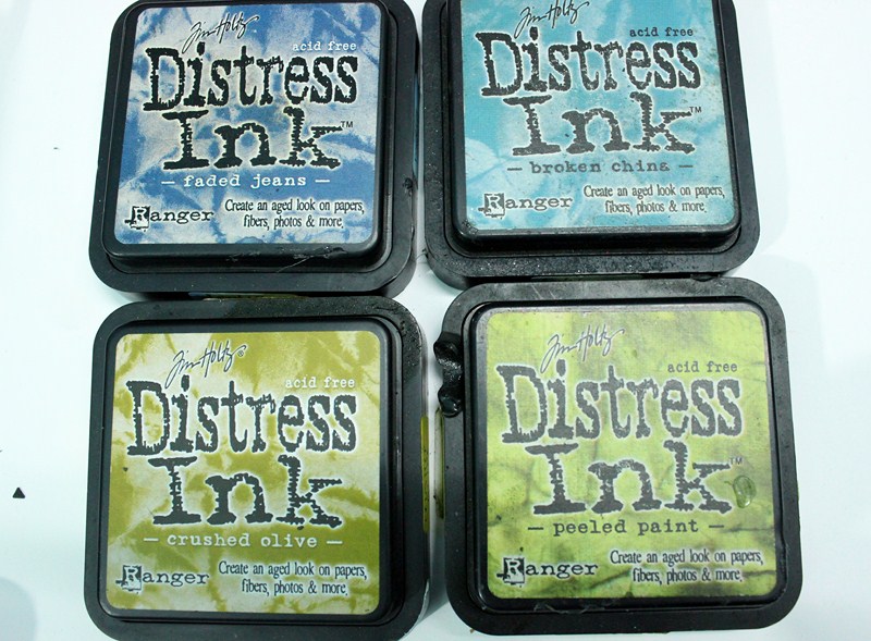
To start with - I bought
1)Work lipistic for Red
2)Peeled Paint to cover Yellow and green
3)Broken China for blue
4)Spice Marmlade for orange
5)dusty concord for Purple
And ofcourse Vinatge photo .
This picture was used in my blog Dated March 17th ,2011 when I got mine .

Now the question - Why I chose them ?
Basically the main idea behind taking these inks at first was to have one member from every color family . As a starter I could apply pressure to get variations in the shades .
How to store these Magic Boxes ?
I basically stack them onto one another . I bought a self adhesive label from a local stationary shop and distressed them with the respective color , wrote the name and pasted it as a strip on the four sides .
Result - I can see the name and color effect which I will get via them .
All the distress inks can be stacked onto one another and they take hardly any space .
.JPG)
What Basic tool I need to get the best effect ?
The must buy along with these inks is a Blending tool . For starting you can have just one tool , and a pack of foam for easy replacement and other colors . They get stuck in and out easily as a velcro patch is there on the tool .
The picture of ink blending tool and blending foam is below .
ALSO THE ITEMS MENTIONED ARE LINKED TO THE PAGE WHERE YOU CAN BUY THEM , SO SIMPLY CLICK THE ITEM AND YOU WILL BE REDIRECTED ON A SEPERATE WINDOW .


Now onto the local jugad - Basically when I started I bought the local Makeup Foam to use these . Believe me , at that time I was happy with the result but now when I use the local ones - I can see the effect was bad.
These blending tool foams are specially designed to tag along with the distress ink pads . They basically blend the ink on the paper - Blending is basically mixing symmetrically . What local foam does is that it gives you clear patches . See the picture below , you will clearly see the difference .

What I have done is have one tool for every color and one foam for every color .
Always keep some extra foams as they worn out with time .
I store these in a wall panel which i got for all my tools .


What Base to use while distressing ?
In our busy life , we generally distress keeping the media onto the cutting mat . Remember - the effect is bad with the cutting mat or table . Ranger has introduced distress mats but you can replace them with simple ohp sheets or pvc bags .
Check the picture of distressing done with ohp base and cutting mat .

What more you should have along with these ? { not mandatory }
Always keep the sprinkle bottles on your table along with tissue .
You should have a distress tear tool - Heart attack for example .
Reinkers of these inks - popular ones { I have vinatge photo }
Heat embossing materials , templates , stamps etc .

How are new distress inks ?
The new twelve distress inks are beautiful , They have more rich look .
I had been using vintage photo alot , but somehow these days I love using gathered twig .
I recommend all the new colors , At present I hoard only 3 of the new ones .
Festive berries and Squeezed lemonade .

How to distress - proper method ? { SINGLE SHADE USE }
Always keep a ohp sheet below . Start from out side the paper rolling and come inside . Give a flicking motion for light shade and more force for dark .
Always start with rubbing the edges first with foams and they do the rolling motion for ink distribution . After that blend more for proper coverage of space . The picture will demonstrate a better explanation .
Try to avoid full foam print , It can always be avoided by the sliding motion .
One super trick - Use the ink pad directly to make edge super defined .


How to use heart attack tool to give fabulous Tearing effect ?
Take your distress tool , rub it with the edge . After sufficient tearing , distress it with your desired color to give a fabulous vintage and torned look - The weathered look .


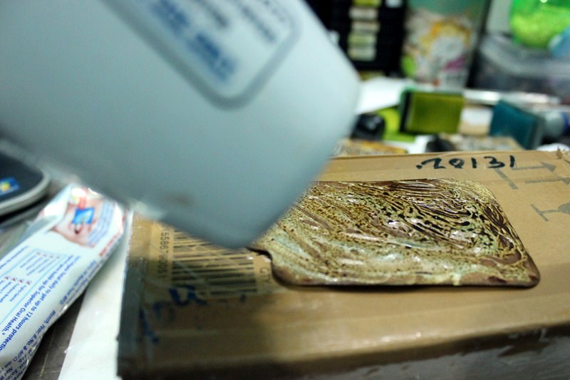
How to make Beautiful Backgrounds ? { Multi Tone }
Now in this via pictures and words I will try to make a beautiful background .
We will basically create a gradient .
I started with Faded jeans , I used the ink pad directly on the the edges to make them more defined . After that start blending from outside to inside in rolling motion .
Once all the sides are done with faded jeans , take your broken china and start your second layer .
After that take crushed olive and peeled paint and mixing those two give a gradient .
In the end blend entire Cardstock with faded jeans again .
 \\
\\


Mixed media with distress inks ?
Now this might shock you , I will now teach you to create a background with the help of COLGATE PASTE !!!
Simply take a white / offwhite piece of paper .
Distress the edges by Walnut Stain , and inside by vintage photo .
After that simply take a paint brush and spread colgate paste unevenly on the surface . REMEMBER UNEVENLY .
Now take your heat gun and heat the the paste till becomes dry .
Once it is dry Distress is again with vintage photo or walnut stain , this step will refine the uneven distribution.
Take your mist bottles , sprinkle the mist .
Let is dry or dry it via Heat emboss Tool .
Result - A beautiful Background . I created this box using the same and a tag .
Pictures below to explain better .


Blending Ink Combinations - How to make them ?
I am illustrating a set of pictures of the combination which I generally use .
There are many more which you can use , Just a rough idea of what I generally use .
Try to take same tones and create a gradient .


I have tried my best to illustrate each and everything which I know about inks above . Please rectify me if you want to add on more information .
For any queries on this .. write in comments below .
Have a great day ,
Mallika
wow amazing mallika
ReplyDeleteReally very informative post. thanks Mallika
ReplyDeletemallika your post is too good and inspiring,thanks for sharing,keep sharing more.
ReplyDeleteMcx Silver Tips Free